


Otsuka Pharmaceutical Co., Ltd.
Corporate
June 26, 2007
New Symbol Signifying Otsuka Pharmaceutical's
Corporate Philosophy Introduced on June 26, 2007
Tokyo, Japan -- Otsuka Pharmaceutical Co., Ltd. (Head Office: Chiyoda-ku, Tokyo, Japan; President: Tatsuo Higuchi) has unveiled a new corporate symbol, developed with the aim of promoting meaningful communication with people all over the world in conjunction with the globalization of Otsuka operations.
New Otsuka Pharmaceutical corporate symbol:
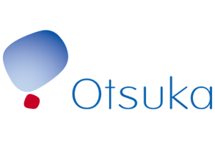
A symbolic representation of Otsuka Pharmaceutical's corporate philosophy, the corporate symbol adopts the initial 'O' of the corporate symbol as a motif. Representing the sky above, the large 'O' is rendered in gradations of Otsuka BLUE intended to signify "openness", "freedom", "intelligence", and "future". The small 'O' in Otsuka RED represents the focused energy of Otsuka Pharmaceutical, the wellspring of these tenets. Offsetting the two forms poised in balance, the Otsuka name is spelled out in an open and friendly typeface. The new corporate symbol conveys Otsuka Pharmaceutical's energetic commitment to human happiness through good health.
Upon the unveiling of the new corporate symbol, Otsuka Pharmaceutical president Tatsuo Higuchi commented, "Since our founding, Otsuka Pharmaceutical has contributed to the health of people all over the world, introducing innovative and creative products while aiming for a symbiotic relationship with local communities and with the natural environment from a global perspective. With the introduction of this corporate symbol, we will redouble our efforts to implement our corporate philosophy in every phase of our activities."
Based on the corporate philosophy of 'Otsuka - people creating new products for better health worldwide', Otsuka Pharmaceutical Co., Ltd. is dedicated to contributing to the health of people around the world.