Corporate Symbol
As a global company group conducting business worldwide, the Otsuka Group has used the Corporate Symbol to symbolize our Corporate Philosophy and unify the way we communicate worldwide.
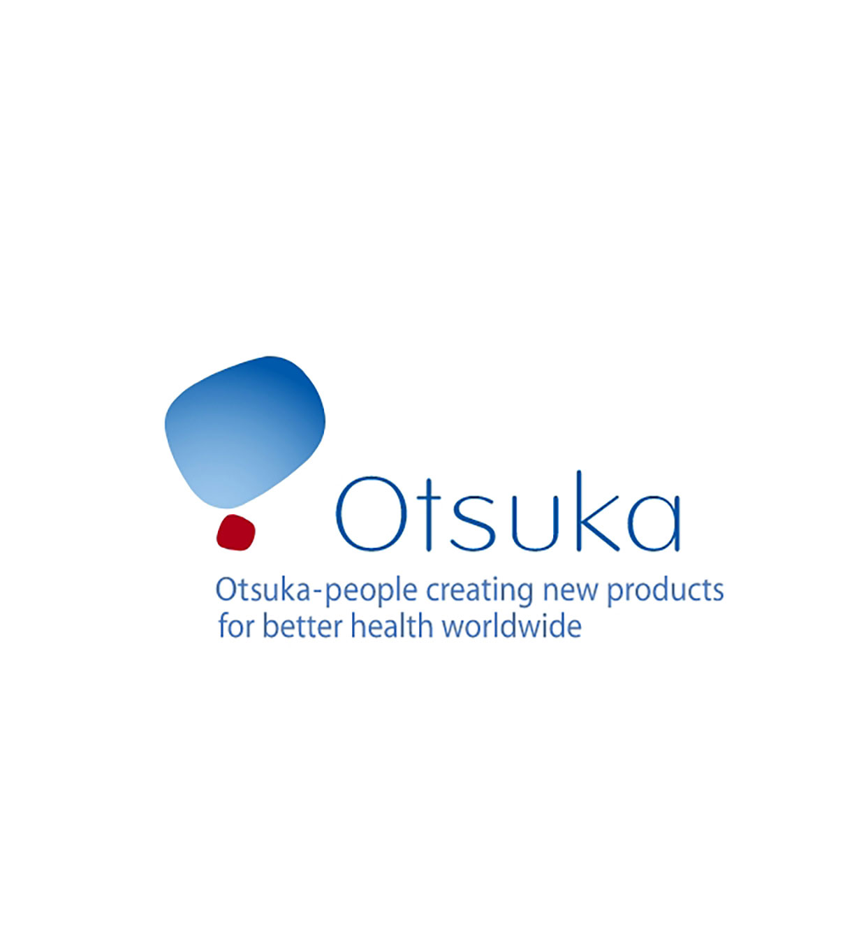
Significance of our corporate symbol
A symbolic representation of Otsuka Pharmaceutical's corporate philosophy, our corporate symbol adopts the initial `O` of our corporate name as a motif. Representing the sky above, the large `O` is rendered in gradations of Otsuka BLUE intended to signify "openness", "freedom", "intelligence", and "future". The small `O` in Otsuka RED represents the focused energy of Otsuka Pharmaceutical, the wellspring of these tenets. Offsetting the two forms poised in balance, the Otsuka name is spelled out in an open and friendly typeface. Our corporate symbol conveys Otsuka Pharmaceutical's energetic commitment to human happiness through good health.
Objective
In conjunction with the rapid globalization of its operations, Otsuka introduced its corporate symbol to promote meaningful communication with people all over the world.
Conceived as a symbolic representation of Otsuka group's corporate philosophy, the symbol signifies Otsuka's global dedication to building harmonious relationships with local communities and protecting the natural ecosystems surrounding our facilities. It also represents our larger goal of contributing to the health and greater well-being of people the world over.

The word "creating" in the Otsuka Group's corporate philosophy of "Otsuka-people creating new products for better health worldwide" is the foundation of everything we do.
As a total healthcare company, we at Otsuka Pharmaceutical are committed to continuing with the research, development, manufacture, and delivery of products that satisfy customer needs, based on our strengths of "jissho" - actualization - and "sozosei" - creativity.